Quick answer
A professional PLR ebook needs a clean structure, consistent typography, an intentional cover, controlled page breaks, checked links and a final PDF review.
What to prepare first
- Editable source file
- Brand colors and logo
- A contents-page decision
- A final CTA destination
- A PDF review checklist
Check structure first
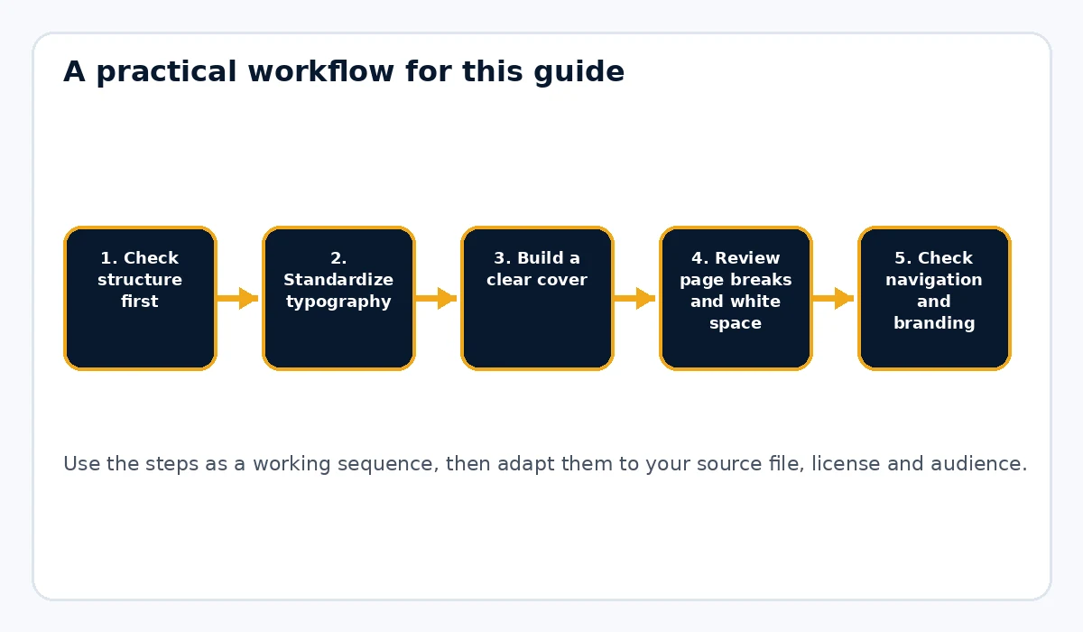
Confirm the title, subtitle, chapters and subheadings are in the right order. If the source file uses random bold text instead of real headings, fix that before anything else. Structure makes every other formatting decision easier.
Standardize typography
Pick one body font and one heading family unless there is a strong reason to do more. Mixed fonts, inconsistent list spacing and random paragraph gaps are some of the fastest ways to make an ebook feel unfinished.
Build a clear cover
The cover should match the audience and topic, but it also needs to be readable at a glance. Use a concise title, a relevant subtitle and consistent brand treatment.
Review page breaks and white space
Pay attention to section breaks, chapter starts and orphaned headings. Good spacing makes a document feel calmer and more deliberate. Too much empty space can feel sloppy, but too little can make the ebook dense and tiring to read.
Check navigation and branding
Decide whether the ebook should have a contents page. For longer documents, it usually helps. Add your footer, publisher name or logo carefully so the branding supports the content without overpowering it.
Audit every link and CTA
Click everything. Replace broken URLs, remove irrelevant links and make sure the final CTA points to the correct offer or page. If you want a more professional export, a tool like Rebrand My PLR can help carry the brand and structure through the final PDF more consistently.
Test the exported PDF
Open the finished file in at least one different viewer and on one smaller screen. Look for text overflow, image stretching, link problems and odd page breaks.
Practical use case
If you publish a PLR report as a low-ticket product, this checklist can be your final gate: structure, cover, page breaks, branding, links and export review before the file ever reaches a customer.
Common mistakes to avoid
- Changing fonts repeatedly inside the same file
- Leaving headings stranded at the bottom of pages
- Forgetting to click links after export
- Using a weak or cluttered cover
- Publishing the PDF without opening it on another device
Read the ebook for rhythm, not just errors
Formatting quality is partly about rhythm. Look at several consecutive pages and ask whether the reader gets enough visual breathing room. A page with four dense paragraphs may need a subheading, short list or callout. A page with too many boxes and banners can feel fragmented. The goal is a consistent reading pace. You can catch many problems by viewing the PDF at thumbnail size: chapter openings, large gaps, crowded pages and accidental blank pages become easier to spot when you see the document as a sequence.
Pay attention to the small page mechanics
Professional-looking ebooks handle awkward page breaks deliberately. Avoid a heading as the last line on a page with its paragraph starting on the next page. Keep very short lists together when possible. Make sure tables do not run off the page and captions stay near their images. Page numbers, footer text and margins should not jump around between sections. These details are easy to miss while editing the source but obvious in the exported PDF.
Check links, file names and closing pages
Formatting is not finished when the pages look good. Click every link in the exported PDF. Make sure the file name describes the product and does not contain working notes such as final2 or revised. Review the closing page for one clear action and confirm that the destination still exists. If the PDF is part of a bundle, check that its name matches the name used on the sales page and in the delivery email. Consistency across the buyer experience is part of professional presentation.
Practical example
Take a PLR ebook with mixed fonts, manual bold headings and inconsistent spacing. Standardize the type system, promote real headings, create predictable chapter starts, rebuild the contents page, fix links and add a branded final action page. The information may be largely the same, but the reader now has a document that is easier to scan, navigate and trust. That is the purpose of formatting: remove friction from the reading experience.
Final publishing check
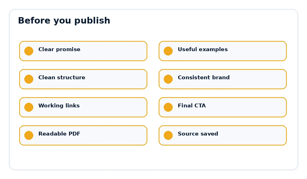
- The page title and document title match the actual promise.
- Examples, links and references are current and relevant.
- The document is easy to scan on desktop and mobile.
- The final call to action points to the correct destination.
- The exported PDF opens cleanly and every important link works.
Use one final review pass for consistency
After individual problems are fixed, read the ebook once more only for consistency. Ignore the wording and look at the visual system: are all H2 headings the same size, are lists indented the same way, are callout boxes used for the same purpose, and do chapter pages follow the same pattern? Check several random pages rather than only the beginning. Inconsistent formatting often appears where content was copied from different source files. A final consistency pass catches those mismatches and helps the document feel like one publication instead of several fragments placed together.
Want the final document to look like a finished product?
Rebrand My PLR helps turn Word, text and Markdown files into more polished branded PDFs with a clearer cover, cleaner sections and a stronger final presentation.
See Rebrand My PLRFrequently asked questions
What is the biggest PLR ebook formatting mistake?
Inconsistency. Mixed styles and uneven spacing make a guide feel unfinished.
Does every PLR ebook need a contents page?
No, but longer guides usually benefit from one.
What should I check after exporting to PDF?
Check headings, page breaks, images, links, footer branding and the final CTA.